.svg)


.svg)
.svg)
.svg)
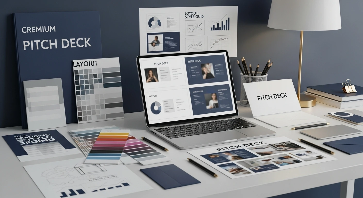
Pitch Deck Design Mistakes That Repel Investors
Every year, hundreds of pitch decks are reviewed by investors, but the majority are dismissed after a cursory glance. Why? Frequently, design errors that convey a lack of preparation, carelessness, or seriousness about your business are what kill the deal, not the idea.

Your first impression is reflected in your pitch deck. Before they even hear your story, investors may be turned off by a poor design. The most frequent pitch deck design errors will be illustrated in this guide, along with tips on how to steer clear of them to gain the confidence of investors and obtain the money you require. Learn how to effectively present your idea to investor and avoid common mistakes that could cost you funding.
Why Design Matters in Your Pitch Deck
Persuasion is more important than information in your pitch deck. Investors quickly form opinions about your company. Effective design facilitates the communication of professionalism, clarity, and trust. Conversely, poor design confuses people and damages your reputation.
In fact, design experts often say people form impressions in less than 50 milliseconds. Harvard Business Review notes that clear, professional visuals improve decision-making and buy-in from stakeholders.
Top Pitch Deck Design Mistakes That Repel Investors
Below are the most common design errors that turn off investors, with simple ways to fix them.
Overloaded Slides
Problem: Slides crammed with dense text and endless bullet points.
Why it’s bad: Investors can't quickly skim or grasp key ideas. They get overwhelmed and disengage.
How to fix:
- Limit slides to one idea each.
- Use concise bullet points (3–5 max).
- Embrace whitespace to make content digestible.
Inconsistent Visual Style
Problem: Fonts, colors, and layouts vary wildly between slides.
Why it’s bad: Looks unprofessional and sloppy, eroding trust.
How to fix:
- Define a brand guide with 1–2 fonts and a consistent color palette.
- Use a professional template throughout.
- Align layouts for a polished, cohesive look.
Poor Data Visualization

Problem: Overly complex charts or tiny, unreadable graphs.
Why it’s bad: Investors can't understand your data story at a glance.
How to fix:
- Simplify charts to highlight one clear takeaway.
- Label axes and data points clearly.
- Avoid clutter—less is more.
Low-Quality Images and Graphics
Problem: Pixelated logos, generic stock photos, sloppy icons.
Why it’s bad: Signals laziness, reduces trust, and feels unprofessional.
How to fix:
- Use high-resolution, branded assets.
- Avoid cliché stock photos.
- Invest in custom visuals if possible.
Ignoring Storytelling and Flow
Problem: Slides feel disconnected, jumping randomly between topics.
Why it’s bad: Investors don’t see a clear, compelling business case.
How to fix:
- Structure your deck as a narrative:
- Problem
- Solution
- Market
- Traction
- Team
- Financials
- Problem
- Ensure each slide logically leads to the next.
Bonus Mistakes to Avoid

Beyond the big ones above, watch out for these extra investor turn-offs:
- Typos and grammatical errors: Undermine your credibility immediately.
- No clear call-to-action: Leave investors wondering what to do next.
- Too many slides: Generally aim for 10–20 slides max.
- Missing critical sections: Don’t skip your team, market size, or financials.
For an excellent primer on what should go in your deck, see Sequoia Capital’s pitch deck guide.
How to Fix a Bad Pitch Deck
If you're worried your deck has design mistakes, here’s how to fix it:
- Use professional templates (Canva, PowerPoint, Keynote).
- Hire a designer for a polished, investor-ready look.
- Get feedback from mentors or early investors.
- Practice your pitch to ensure design supports delivery.
- Emphasize clarity over flashiness.
For further help, check out Y Combinator’s Startup Library for practical tips on creating investor materials.
Conclusion and Next Steps
Your pitch deck is more than slides—it's your business story. Avoid these pitch deck design mistakes to make a strong first impression, win investor trust, and boost your chances of getting funded.
Next steps: Review your existing deck, fix errors, and rehearse your pitch until it’s crystal clear.
Need help? Contact us for a professional pitch deck review or design service!
Common design mistakes—like cluttered slides, inconsistent branding, and hard-to-read text—can quickly turn investors off and undermine your message. A well-designed pitch deck should be clear, professional, and engaging to keep their attention and build confidence in your vision. If you’d like expert help perfecting your deck, contact us today.
FAQs About Pitch Deck Design
Q: How many slides should a pitch deck have?
A: Aim for 10–20 slides, depending on your audience and context.
Q: Do investors realy care about design?
A: Absolutely. Good design shows you're serious, detail-oriented, and trustworthy.
Q: Can I use Canva or PowerPoint templates?
A: Yes! Just make sure they're customized, consistent, and professional.
Ready to take your pitch deck to the next level?
Contact Us today to get started!Common Questions
It should include the problem, solution, market size, business model, team, and financials.
Aim for 10-15 slides to keep it concise and easy to digest.
Focus on clear messaging, strong visuals, and a compelling value proposition early on.
Highlight the problem, solution, and market opportunity in a visually simple format.
Yes, investors often decide quickly, so capturing attention quickly is crucial.
Keep it clear and simple, or consider pitch deck consulting services like Capex Funds.
Latest Posts


FAQs
01
Who does Capex Funds typically work with?
.svg)
We partner with real estate operators, syndicators, fund managers, and developers who are actively raising capital, whether it's their first fund or their fifth. If you're looking to grow your investor base and raise capital more quickly, we can help.
02
What advantages does partnering with Capex Funds offer for my capital raising efforts?
We partner with real estate operators, syndicators, fund managers, and developers who are actively raising capital, whether it's their first fund or their fifth. If you're looking to grow your investor base and raise capital more quickly, we can help.
03
How do I get a pitch deck redesign?
We partner with real estate operators, syndicators, fund managers, and developers who are actively raising capital, whether it's their first fund or their fifth. If you're looking to grow your investor base and raise capital more quickly, we can help.
.svg)
.svg)
.svg)
.svg)